 Simplified Startup
How to Create a Strong Brand Identity for a New Business
Most founders start with the logo. It’s the visible portion, it seems like progress and a designer can turn this around in two weeks.
Meanwhile the thing you may really lose is the name. The number one reason the United States Patent and Trademark Office will decline an application is because there is a likelihood of confusion with a mark that someone else previously registered. Not because the name was horrible. Just that it was taken and nobody checked before the signage went up.
So the first act of working on brand identity is not a design brief. It’s a search.
What is brand identity really
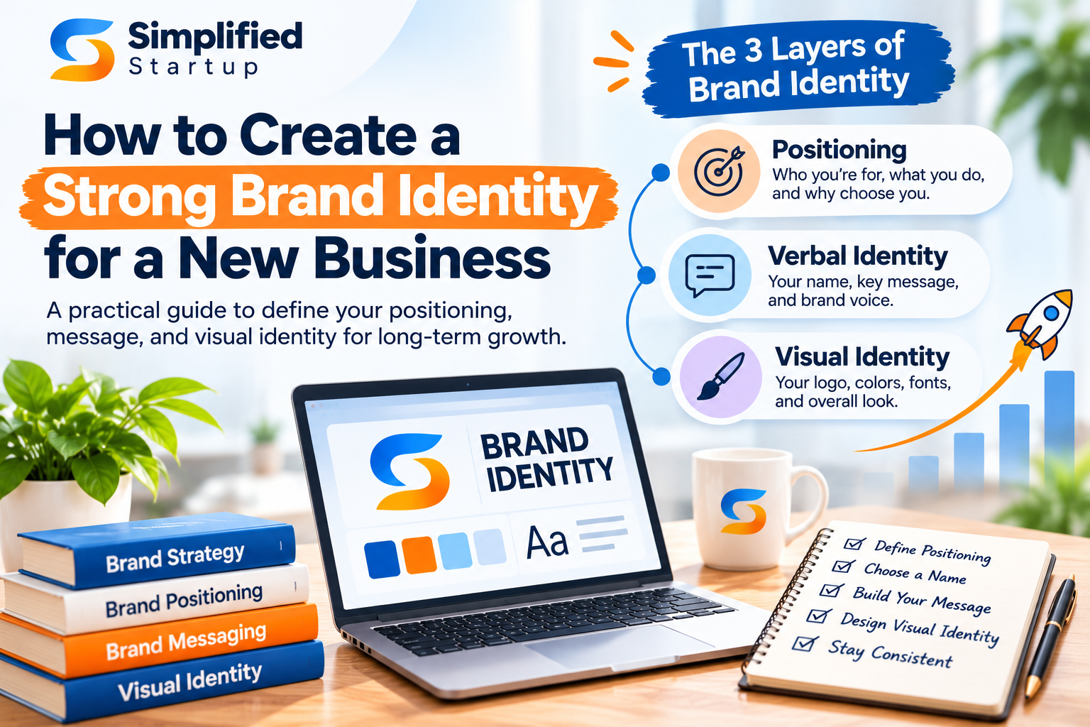
There are 3 layers. They work in order.
Positioning Who you’re for, what you do and why someone would choose you over the option they already have. This is strategy and it governs everything above it.
Verbal Identity The name, the one line of description, the way you talk. What a founder says on a call, again and again.
Visual identity. Logo, color, type and images. The stuff everyone thinks of when they think branding, and the stuff that can’t solve an issue in the two levels below it.
Brand identity for startups goes wrong nearly exclusively because of this reversal of the order. A beautiful visual system based on confusing positioning equals a corporation that seems legitimate but can’t explain itself.
Positioning, before anything is designed
You can do this in a week and most founders never do it.
Who is this for, exactly. Not “small businesses.” A sector so narrow you could name twenty real enterprises in it.
Instead, what do they do now? Your real competition is usually a spreadsheet, an agency or doing nothing. And when you name it right it affects your whole message.
What does it do that the alternative doesn’t? Something that is defensible, something a customer would recognize.
Why would people believe you. Experience. Results. Guarantee. Credential. Something that isn’t an adjective.
Write the answers in 4 sentences. If you can’t, it’s not your logo’s fault.
Real narrow brand positioning feels unpleasant to entrepreneurs because it feels like it’s excluding individuals. It does, and that’s how it works. No one chooses the choice made for everyone.
The test that tells you whether the positioning is authentic
Most founders think they are done with their posture once it’s in writing. It is complete when other people can do it again.
So try it out. Tell five individuals who don’t know your business your one liner, then ask them what you do a day later. Whatever the document states, what comes back is your actual positioning.
Usually three things take place. They are describing a category you did not mean. They are describing a competition. Or they say something ambiguous and say sorry. All three are beneficial, and none is a design fault.
Founders that neglect this stage usually learn the same lesson eighteen months later when a sales call goes nowhere.
The Name and the Quest Before You Fall in Love
Do this before you print, register or buy anything.
Search the USPTO database for your name and names that sound like yours in your category. Likelihood of confusion involves similar marks on connected goods and services, not just identical marks.
Verify the domain, and at the same time check the main social handles. A name for which you can’t get a functional domain is a price you pay eternally.
Say it out loud on the phone. If it has to be spelled every introduction, that is friction for the life of the company.
Search it in vanilla Google. Find out what else something is called, in other languages and other businesses.
Founders push back on this because they’ve made a decision. The hunt goes on for an hour. Renaming a firm 18 months in costs the domain, the signs, the SEO equity, the printed material and the embarrassing explanation to every customer you have.
Verbal identity that founders take for granted
They read a text before they see your logo.
The punch line. What you do, for whom, and what happens. No metaphors. It’s not complete if a stranger can’t repeat it back.
The vocabulary you have. Three or four words you consistently use to describe what your product performs. Wit here is regarded less than consistency.
The words you deny. Most categories have a list of exhausted claims. It is easier to decide what you will not say than what you will.
Tone. Not “friendly but professional” which is a description of everything. Choose a register you can actually maintain in support emails at 11PM.
A startup branding strategy that nails the verbal layer and has an average logo will outperform the reverse. The verbal layer is what gets repeated by other people.
Visual identity: What you really need at launch
Less than what you’ve been sold.
A wordmark. Your name, done well. This is all most early-stage firms require.
One or two fonts. License includes use on the web.
A tiny set of colors. One primary, one dark, one light, and one accent. More than that and there is no consistency.
Simple rule for visuals. One direction: photography or illustration, so the website doesn’t look put together.
A one-page paper recording all of it. So the next person to touch anything has it.
What you don’t need at launch: a brand book, a mascot, an icon system, a secondary palette or a bespoke typeface. Those are when you have customers who know you.
Business logo and brand identity are not the same thing
Confusion costs money. Worth splitting.
One of the assets is a logo for a firm. Brand identity is a comprehensive system, most of it not visual at all. Founders that confuse business logo and brand identity sometimes spend their funds on the smallest component and wonder why nothing feels cohesive.
A start-up’s brand identity is primarily about decision, not assets. The assets are the decisions as they are when somebody renders them.
A good test: If your logo were removed from your site, would a visitor still be able to tell who you are and what you do? If the answer is no, then the logo never was the problem.
What sequence to spend in.
At this point budgets are real and the order is more important than the sum.
Do trademark search first. It is the cheapest step and the only one that avoids an irreversible error.
Then positioning. You can do that internally if you are rigorous about it and it makes everything downstream cheaper since the brief is clear.
Third is simple system and wordmark. Deliberately sparse.
A website that converts. A boring logo doesn’t cost founders money, but a confusing homepage does.
Everything else where there is proof it is required.
One other thing on sequence. It is common for founders to acquire the website and the identity from two different suppliers at the same time. The site is developed around a brand that has not been decided yet. If both are happening, one person should have all the briefings.
Spending out of sequence is the most common way early branding budgets go poof with nothing to show for it.
Where brand identity meets the website
For most new firms the brand is the website. It is where practically everyone encounters you, and where an identity either holds or falls apart.
The one-liner is above the fold, in straightforward language. Not a tag line. What you might say if someone asked you at a party.
The proof follows. Logos, number, named result. Something that isn’t a descriptor about myself.
One action, primary, repeated. Sites with four competing calls to action convert worse than sites with one.
The visual system is used consistently, which at this point entails restraint for the most part.
A straightforward site that says what it means is better than a gorgeous site that forces a visitor to figure out what you’re selling. This is the single biggest delta between how a founder thinks about their brand and how a stranger perceives it.
Cleverness is no match for consistency
The companies that seem to have been around forever are rarely the most creative. They were the ones that did the same thing every time.
Same colors, same font, same one-liner, same tone, across the site, the deck, the emails and the invoices. Repetition is what makes anything seem familiar, and familiarity is much of what people mean when they say something feels trustworthy.
The practical version: Pick the four or five areas your brand actually shows up and assess them once a quarter against your one-pager. Website, deck, email signature, social profiles, invoices. That’s a twenty minute work, and it’s the whole of brand upkeep for most early stage organizations.
This is also the part that costs nothing and is the first to go when a firm gets busy.
Branding for Small Business on a Real Budget
If you’re not venture funded, the constraint isn’t innovation. It is time.
Do the positioning yourself. In writing. No one can accomplish this for you, because the answers are within your business.
Pay for the name search and if you can pay for the filing.
Hire a qualified person for a wordmark instead of creating twelve variants you can’t choose between.
Use a template for the deck and the docs. No one has ever bought for the slide design.
Come back in a year when you know who your customers really are, not who you thought they were.
A limited budget is a cause why small business branding failures but inconsistency is a bigger one. It’s a simple identity and it reads the same everyplace and that’s by design. A complicated one which employed three different methods reads like chaos.
When to rebrand—and when not to
Reasons that justify it: a name you can’t own, a name that no longer expresses what you sell, a merger or a positioning shift that is truly different, not a refreshed adjective.
Reasons why not: you’re bored with it, a competitor launched something nicer, or a new recruit has opinions. A rebrand resets awareness you’ve already spent to build, and most early companies do it before they have enough recognition for the reset to be the true expense.
If something is wrong and you can’t tell which of the three layers it is, the answer is not a rebrand. It’s a diagnosis.
The 5 most expensive blunders
Designing before you decide. A logo brief without positioning will lead to solutions that are impossible to choose between because there is no criterion to choose from.
Falling for a name before you run it down. You pay a lawyer to explain why the order is to search, then fall in love. Never the other way round.
Copying the category leader. If you look like them in identity, you have convinced the market that you are the cheaper version of them.
Building a brand for investors instead of customers. Investors want to see momentum. Customers see if you understand their difficulty.
Considering it done. What you write for positioning before you launch is a guess. It should alter when you have twenty consumers and a reputation light enough to change is an advantage not a compromise.
Thirty-day version
Week one. Positioning in four written sentences. Trademark search. Verified domain and handles.
Second week. The words and the one liner. Say both to five people who don’t know your business and observe what they repeat back to you.
Week three. One page document. Color. Type. Wordmark.
Week four. Use it everyplace – site-wide, on the deck, in the email signature. Then halt.
That’s a full startup branding plan for a firm that doesn’t know its market completely yet, which is every company at this time.
30 days is plenty for an early stage firm. Anything longer is usually avoidance of a harder problem, which is that the posture is unsettled.
Common Questions
What is brand identity for startups?
Positioning, verbal identification and visual identity, in that order: the system that makes a new organization recognized and intelligible. The visual layer is the least part of it.
Do I need a logo before I start?
You need to get your name right. The whole logo can wait. Many organizations started, identified consumers, then built the identity based on what they learnt.
How much does it cost to brand a startup?
Depends tremendously on scope. But the sequencing is what’s important. Trademark search, then positioning, then a simple graphic system, then the website. Branding feels pricey because it’s spending out of order.
What is brand positioning in one sentence?
What you do, who you’re for and why someone would select you over the alternative they’re using today.
Can I do it on my own?
The positioning, certainly, and you should arguably. The trademark search and the wordmark are worth paying for, because the first avoids a disaster and the second is hard to accomplish successfully without instruction.
How does this vary for a small business and a startup?
The work is identical. The time line is different. A company is usually still looking for its market, thus the brand has to be light enough to alter. As a rule, a small business understands its clients and can commit more.
So what does that leave you with?
Brand identity is not decoration, stuck on at the end. It’s the sequence of four decisions, and most new firms make them backward.
Search for the name. Write the position. Then create something. And utilize it the same every time.
Simplified Startup works with founders on brand strategy, positioning and visual identity as one engagement versus three different vendors. Schedule a free session and bring the four sentences, or the fact that you can not yet compose them.