 Simplified Startup
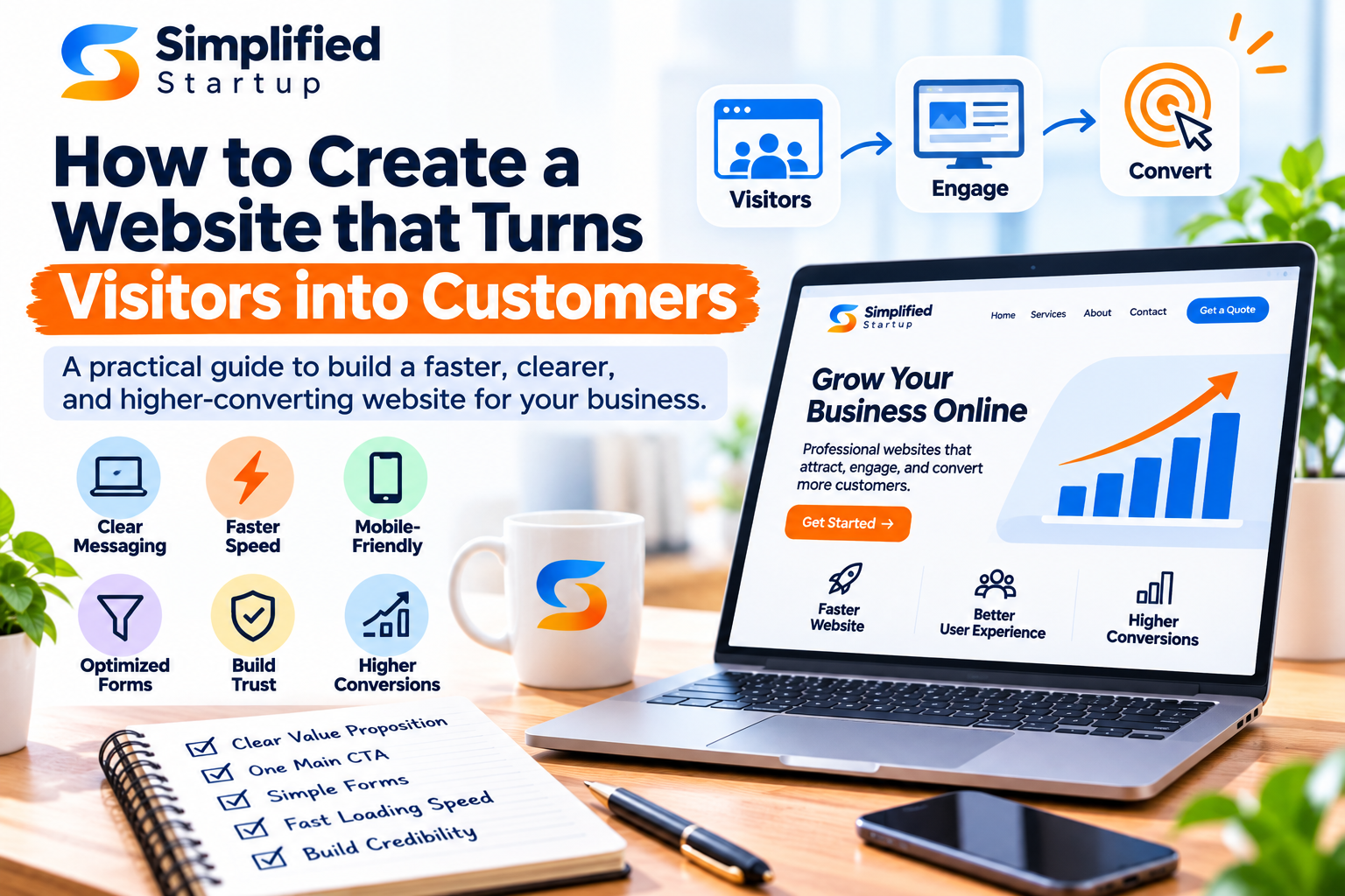
How to Create a Website that Turns Visitors into Customers
Optimizely looked at roughly 127,000 trials across 1,100 companies and found that just about 12% of them resulted in a win on the primary metric. 9 out of 10 changes a team had the faith to create, build and ship, did nothing. Or worsened things.
Take that number with a grain of salt as anyone who quotes victory rates in this space has their own definition. Some only count statistically significant winners, some exclude inconclusive tests and the numbers are anything from below 10% to above 50% depending on which criteria is used. The revenue related ones are down near the bottom.
The useful conclusion is not that testing is pointless. It’s that gut sense about what will sell that is not reliable, yours included, an agency’s included. Which is a significant deal if you are small, for one thing nobody talks about.
Most of the small sites can’t do a proper test and should stop trying
“Testing requires traffic. Traffic is not heavy. Some traffic. And the math is brutal.
If a page converts at 3% you need a few thousand visits each variation to see a big boost, before the result means anything. If a site has 1000 visitors a month, it’s going to take months to get there. And by the time it does, the season has changed, the marketing campaign has changed, and the test is measuring something else other than the change.
So small scale website conversion optimization is not a trial program. It’s fixing something you know is broken, not waiting for permission from a statistic you can’t create.
That’s a terrific news. Most of the known issues are obvious once someone points them out and can be fixed faster than they can be tested.
Two Minute Audit for Today
Do this before any of the other fixes listed. Two minutes and you have the list.
Open your homepage on your phone with a browser you’ve never used before, so nothing is cached.
Count the seconds till you can read anything valuable. Not until it’s loaded, until you can read it.
Imagine that you have never heard of your company and read the first screen. What kind of business do you think this is? Look at what it does and compare.
Identify the single item you need to do next. Time it.
Fill out your own form. All of it. With his thumb.
In almost every engagement to optimize website conversions, it starts with finding things that the owner may have found in those two minutes. When you do things yourself first, you pay someone to uncover problems, not repair them.
The 5 things above the fold
A visitor decides in the first few seconds if they want to keep reading. They have serious questions and these five answer them.
What the hell is this thing. Simply put, not a slogan. If a stranger can’t repeat it back, rephrase it.
Who is it for? The feature of naming the audience has the effect of disqualifying unsuitable people.
What it does to me. The outcome, not the bullet points.
Why should I believe you? You can see one proof without scrolling. A numeral. A credential.A client with name .
Now what do I do now? One action, not four.
Most small business home sites answer one or two of these and hide the others. Just doing that will more reliably move the website conversion rate than everything else on this page.
1 action per page.
The most common structural problem is the selection.
A homepage with a demo, newsletter, download, call and chat widget is not giving the visitor five options. And that has given them a decision to make before they can do anything. Such a decision usually results in nothing.
This is also the hardest thing to sell internally because every team wants their link on the home page. The argument is conversion rate on the website. One action page is better than five action pages and it is shown even at small scale.
Pick what you want. Say that again. Everything else is a secondary link, further down the page, visually quieter.
Forms, where the biggest loss happens
This week you just need to fix the form.
Trim fields to what you truly need to answer. Then you can talk with a human and ask about company size, job title, how they heard about you, etc.
Tell me what happens next. We’ll get back to you within one working day’ removes the primary reason people hold back.
Don’t ask for a number unless you’re intending to call them, and tell them if you are.
Show mistakes next to field instead of at the top after submit.
Write on the button what it does. “Get the proposal” is better than “Submit”
Every field is an opportunity to stop. The test for whether to keep one is do you not answer someone who left it blank.
Speed, and how much of it Google spills over
If a site is slow, none of the above matters because visitors leave.
Google has set specifications for its Core Web Vitals. Largest Contentful Paint should be 2.5 seconds or less. Interaction to Next Paint should be 200 milliseconds or less. Cumulative Layout Shift should be 0.1 or less. These are measurable, free to check, and the same signals Google uses to rank.
The standard suspects on tiny company website are a no brainier. Raw images, a page builder loading scripts for features no one uses, three monitoring tools when one would do, fonts loaded from four different sources.
You may check your own pages against these thresholds for free and the report will tell you which element is the culprit. One image in particular most small company sites fail on.
This is the least sexy thing on the list, but typically the biggest single change you can make.
Trust: It Costs Less Than You Think
Real names. Real photographs. “Stock photos of people in meetings have the opposite effect as intended.
Physical address and phone number (visible). The quiet is sensed even if no one calls.
I want evidence, not adjectives. “trusted by industry leaders” is not the same as “cut response time from two days to four hours”
Pricing (or at least a pricing range). Sites that don’t include any pricing information at all lose visitors who were a good fit but were just looking to see whether they could afford it.
Remove everything that’s not true yet. An empty testimonials page is worse than no testimonials at all.
Mobile is not a scaled-down version
Most small businesses get most of their visits on a phone and the phone version is most typically built second.
Test the form on a real phone, not on a simulator. Field types, keyboard behavior, autofill all break in ways that you won’t see in a browser.
Tap targets need some space. Two links are a few pixels apart, resulting in misclicks and bounces.
The one action should be accessible without searching. Sticky buttons are not elegant, but they work.
Try holding the phone with one hand, like people do.
Landing page optimization is another task
The work is different and the two are confused therefore they are worth separating.
A website serves many purposes at the same time: people researching, people comparing, people that already chosen, people asking for help. Landing page optimization: One goal, typically a paid one, without navigation and exits.
If you’re running ads to your home page, you’re almost certainly losing money. A homepage must appeal to everyone. A landing page only has to satisfy the person who clicked that one ad, therefore it can say exactly what that ad said it would.
Conversion focused website design means that the site is developed with the activities that you want in mind. That doesn’t mean every page is a Landing Page.
What conversion-focused website design actually changes
The term is used to refer to a style of visual. This isn’t the one.
A conversion-centric website design is when every page has a task, the job is written down before anything is drawn, and the layout is derived from that work. That choice informed the visual language, not the other way around.
In practice it does four things.
Pages become shorter. Anything that doesn’t accomplish the job goes out.
Navigation gets smaller. All menu items lead to exits.
We write copy first and design second. This implies real words in the design, not lorem ipsum text that no one ever reads again.
One key action every page is agreed in advance, not worked out at the end.
Sites created this way are often more plain than sites designed to amaze you. It is also often the one which receives the query because there is nothing on it to compete for attention with the thing you really desire.
Traffic quality that cannot be addressed with conversion work
Sometimes a poor converting page is a page problem. Sometimes it’s the wrong visitors.
Make sure you check the conversion rate by source before changing anything. If the organic is converting at 4%, and one ad campaign is converting at 0.2%, the page isn’t the problem.
Usually it is the paid broad match keywords. Traffic comes in for some associated thing that you don’t sell.
Look at the search terms report, not the keyword list. They are not the same and that’s where the money is coming from.
If a page converts well on low traffic and bad on high traffic it’s likely just aiming at the incorrect audience.
This is important because conversion work is often commissioned as a solution to a traffic problem it cannot solve. The math is straightforward. Double a conversion rate on the wrong audience, and you double a small number.
What to measure, what not to measure
Conversion rate by page, per traffic source. Not site-wide. One page is torn and is covered by a jumbled figure.
Form starts vs. form completions. The spacing between them is the most obvious signal at most sites.
Scroll depth on long pages (where do people stop reading?)
Time to initially reply to questions. A converting site and a business that replies in 4 days is still losing.
Get a base line before doing anything. If you didn’t have it, you’d be arguing next quarter about whether the work helped. That’s a lose-lose discussion.
What not to pay attention to: bounce rate alone, average time on page and any single sitewide number without a source and a date.
Step by Step Web Design for Small Business
Budget is real and order of budget effects what you get.
First, correct the message. Thought costs nothing above-the-fold clarity.
Then the shape and the one act.
Then accelerate.
Then rely on actual material elements not placeholders.
Test if you’ve got the traffic.
What goes wrong with small company website design? Rebuilding is the priority. The new site performs just as well as the old one, with the same confused message, at a far greater cost.
Testing that really works
If you have the traffic, test it, test it right.
One change at a time. Otherwise you won’t know which change caused it.
Set your sample size in advance and don’t peek at the results too soon. So you quit when it looks good and that’s how noise becomes the decision.
Try things to see why you do them. The color of a button is less than a theory based on a recording or a support ticket.
Assume most of your tests will fail. This is regular rate and not a reflection on anyone.
The most costly mistakes
Redesigning when the message was the issue. Expensive, slow and most of the time it makes the conversion worse as the familiar paths are no longer there.
Stealing a layout from a competitor. You can’t view their data so you don’t know if it works for them as well.
Always adding, never taking away. Most of the bad pages are too long and demand too much.
You send paid traffic to a page you haven’t checked on a mobile phone.
Treating it as a project, not a habit. The sites that get better are the sites that people view every month.
FAQs
What is website conversion optimization?
Eliminate the reasons your visitors don’t do what you want them to do and increase the percentage who do. Testing is being carried out on a bigger scale. It’s really just fixing known problems on a smaller scale.
What’s a good conversion rate for a website?
It’s so reliant on industry, source of visitors and what a conversion is that any single number is inaccurate. The helpful baseline is your own number from last quarter.
Do I need to redesign my website?
Not the first, generally. You can repair messaging, forms and speed on most existing sites and that tells you if the structure is the real problem.
What makes Landing Page Optimization different?
A landing page has one intention, usually from a paid click, no navigation. A website might be numerous things at once. The most common example of this mistake is driving ads to a home page.
When will results be seen?
If your traffic is consistent, you should observe changes to the message and form in weeks. The metrics are showing speed gains fast, revenue improvements slow. Testing programs take months, and enough traffic to be valid.
Can I accomplish this on my own?
Yes, the message and the shape and the cutting down of clutter. Failure modes are not evident . Structural modifications and speed work usually need someone that does it regularly .
What this means for you
Most websites don’t convert because they make the customer guess what they are giving and then make it difficult to say yes. Almost no stuff needs a test to learn it.
Try to read your own webpage like you are a stranger. Your own form. On your cell phone. And the list is what bothers you in those two minutes.
Simplified Startup builds and fixes websites for Founders, with message and design done in the same engagement vs. two suppliers. Book a free session, bring the page you’re least happy with.